All images reproduced in this post have been included by kind permission of their original author. The copyright remains with the photographer stated. All other images are my own.
Introduction
The course materials ask us to do some research into contemporary street photography. To be perfectly frank, I've been doing this for a while, for over two years in fact. And my summer this year has been nothing but street photography, having participated in an
In-Public workshop and a four-day LSP course on Photojournalism and Street Photography (see:
Day One,
Day Two,
Day Three,
Day Four).
And later on this year, I will be participating in a week-long street photography work-shop in Varanasi, India with
Maciej Dakowicz. Plus, I should mention my own
extra-curricular efforts (see various related
albums on Flickr) .... although more miss than hit at the moment (not sure I'm blessed in this department......).
So having been exposed to so many sources and descriptions of street photography, I feel that I'm in quite a good place to be able to write up a summary of the contemporary street photographers that inspire and influence me. I'm also going to write this from the point of view of preparation for themes for the
street photography exercise also for Project Three.
(Click the "street photography" label below to identify all work related to street photography during this Context and Narrative module).
Background
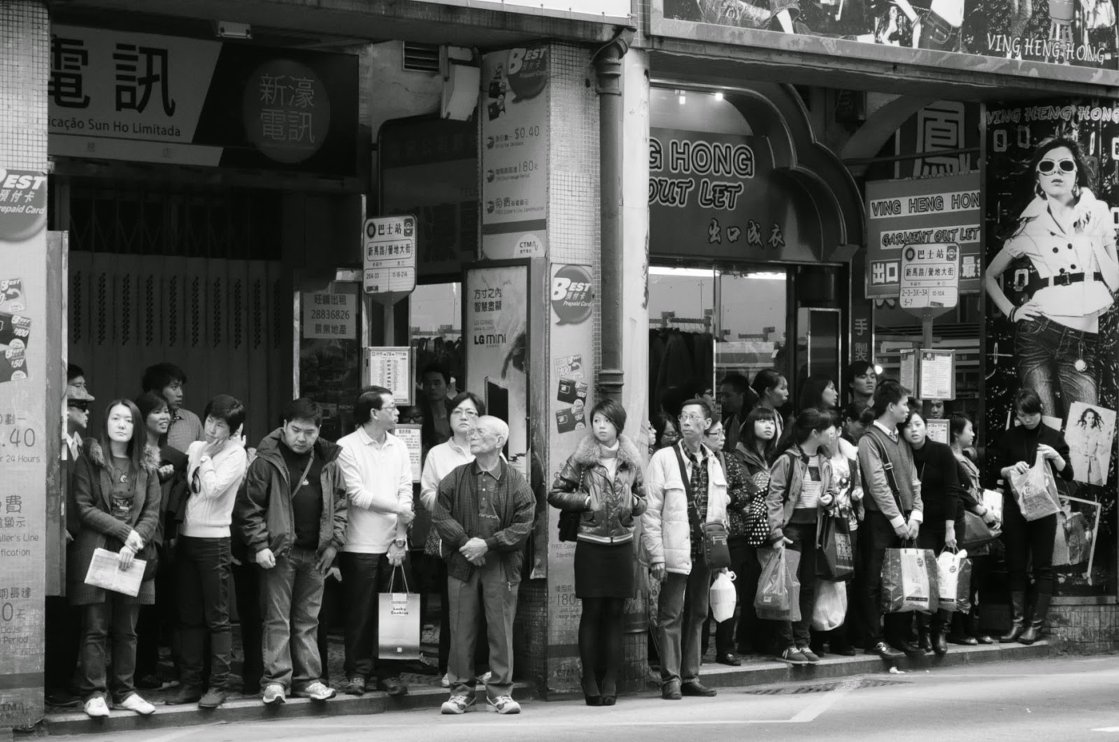
I discovered street photography by accident. I bought my first DSLR (a Nikon D5000) in Hong Kong in December 2010, and without knowing anything about a) how to use it or b) anything about photography at all, I just started shooting random tourist shots of things I liked, and on a trip to Macao produced a couple of images that really kick-started my interest in behaviour and moments in time in public situations:
It was then during a conversation with my then
TAOP tutor, where I mentioned that I just liked taking photos of situations in the street, that he recommended I get a copy of
Street Photography Now, on which I posted a review in July 2012. This was really the epiphany moment! And it was from the revelation of this book that I got to know the work of many of the photographers whose work I now follow (some mentioned below). After that, there followed two years of some unstructured experimenting and reading, until this summer, where in the quest to find my own style and meaning to photography, I decided to take some courses and workshops specifically in street photography (incidentally, I am still torn between street, travel and wildlife photography...and getting to the point where I think I just like to photograph "life" irrespective of genre....why does it need a label?).
What is Street Photography?
I have found over the past couple of years, that a much debated question is what exactly is street photography? What does it mean? What is the point of it?
It seems to me that different people have different perspectives on street photography.
An academic viewpoint is that expressed by Paul Halliday in
Defining Street Photography, which is an all-encompassing all aspects of the narratives of the street. And in fact, an awful lot of what I see on the internet and in publications described as street photography includes portraits, urban landscapes, travel scenes, and street scenes in general, as generally examined in Freeman, 2011 (see previous
review). However, and contrary to Halliday, I enjoy a different contemporary branch of street photography that focuses on the funny and the strange, as described below and which is consistent with the In-Public perspective on this, (bearing in mind that the boundaries with travel photography can be blurred as in Dakowicz (2011) Pillow - see below).
In my own work I try to make a distinction between social documentary, portraiture, landscape and street photography - although all of these can of course be executed in the street and are recognisable as forming part of the broader street photography genre. For instance, I would describe this photograph taken in July 2014 in Camden Town as a street portrait (albeit candid), rather than street photography:
because, apart from the beautiful subject, light and colours, there is not a lot more to it. But perhaps this photograph taken in Worthing in August 2014, which, although also a portrait, is more street photography because it tells a story and has a sense of irony (funny or sad depending on how you look at it) about the last days of summer (Last of the Summer Wine?):
What I have gained from general reading, exhibitions, meeting other photographers and my participation in the In-Public workshop, is that firstly, street photography does not need to have been taken in a street. For instance,
Nils Jorgensen recreated the legend of the
Underwater Gnomes of Wastwater (2011) in Cumbria reported by BBC News, although he was nowhere near a street at the time!
 |
| Underwater Gnomes (c) by Nils Jorgensen |
Street photography also does not need to include animate objects, for example
Matt Stuart's capture of an apparent peacock in New Bond Street (2006) (also features on the back cover of Street Photography Now):
 |
| New Bond Street (c) by Matt Stuart |
In my view (formed by wider reading and attendance at workshops), and this is how I try to form my own practice, street photography is the manifestation and capture of one or more of the following events in a public context:
- incongruence between two or more elements in the image, i.e. a situation that is absurd in its context, a twist, a strange juxtaposition
- resonance between two or more elements in the image
- something comical (but it has to be more than a person dressed in a funny costume....), i.e. interaction with a background
- something comical that has a deeper social meaning
- social commentary
- something completely unexpected
- irony / satire (akin to Far Side situations)
- order out of chaos
- extraordinary use of light
- interplay of colour
- portraits provided they are candid and tell a story or present the subject in a comical or other emotive, or cultural perspective
- a situation made funny by the title and composition, as in Jorgensen (2011) Underwater Gnomes above (this particularly works well with dry humour or the art of understatement!).
People always say that you should know why you are taking a photograph and be able to answer questions about what the point is of what your image? I think that once you have established the boundaries of street photography described above, the answer to that is clear: to make people laugh or to support a social dialogue.
I think of street photography as almost the photography equivalent to jazz music. It has its own rules (i.e. it breaks the traditional rules of composition), its own rhythm, it own timing and its own direction. The right-brained approach to its execution suits my spontaneous nature. You can plan street photography as much as you like (i.e. locate a suitable background and wait for the right subject), but it is highly dependent on random events coming together in one scene or sequence. Personally, I love that moment of panic when you realise that you have a situation in front of you and you've got to grab it then and there. It's an adrenalin rush when it happens and even better if it works out!
In the next sections, I'll look at a few of my favourite images by some of the contemporary photographers (listed in alphabetical order) that I find inspiring, and will comment on why the images are interesting and what the edge is that makes them street photography, rather than just a captured scene.
Maciej Dakowicz
Dakowicz is a now Mumbai-based reportage and street photographer. He has previously lived in the UK in Cardiff, Wales, where he shot the images for his monograph
Cardiff After Dark, a collection of 99 colour photographs depicting scenes shot in streets in Cardiff once the pubs had shut and the party had really begun. At first glance, these photos are hilarious: funny people doing funny things after a "few too many". The feat of this collection, and the commitment to its production, should not be under estimated: "...he photographed the same few streets in Cardiff on a Saturday night for five years" (O'Hagen in Dakowicz, 2012, p9).
You can take these photos at face value (i.e. without social judgement) as just people having fun. However, you could also read a deeper social commentary into this about the British way of life, our apparent obsession with alcohol over-consumption, and the lack of shame when we do it. I however prefer to enjoy the former (as I know I've been there too!), the sheer hilarity of these situations. Is Dakowicz taking advantage of people in compiling this work? Are these photographs gratuitous? I don't think so; a) its within his photographer's rights and b) in my mind, if you've put yourself in such a situation in public then fair game! I would describe this kind of street photography as fitting into the something comical that has a deeper social meaning theme mentioned above. You could also describe it as reportage, as it belongs in a collection providing an insight into a situation.
Picking out one photograph from this collection to illustrate the point is not easy. They are all relevant, but I am still drawn to the very first one I saw when I originally looked at in Street Photography Now, and which had me in stitches (for the sense of normality and concentration in the subject's expression); it is published in Dakowicz, 2012, p39 and in Howarth
et al, 2012 p32; the photograph was taken in 2006:
 |
| Pink Hat (c) by Maciej Dakowicz |
There is however another side to Dakowicz's street photography and a significant portion of this kind of work has been shot in Asia. And I think this is where the boundary between street and travel photography, and indeed reportage, become blurred. One image that really demonstrates this for me is:
 |
| Pillow (c) Maciej Dakowicz |
This is street photography, because it is a comical (although also slightly sad) image shot in a public place. It contains a sense of irony (enhanced by the title). You can read a social commentary/reportage into this i.e. about the stray dogs of India, and of course it is also travel photography because it's providing an insight into the way of life in another country. I actually don't really care that it is any of the above. I'm drawn to this as an emotive response as I have seen my own dogs put their heads in strange and uncomfortable looking places. I also wish I'd taken it!
Melanie Einzig
Like most of the other contemporary street photographers I'm familiar with, I first came across New York-based
Einzig through Howarth
et al, 2012 pp 40-43, in which she is described (p40) as a "whimsical anthropologist". Interesting that she says her best photographs are taken on the way to and from work; my brain is usually too broken to be able to do that, but I should try harder. Einzig's photographs are bright and colourful, and the one I particularly like is shown on Howarth
et al, 2012 p43 of a gentleman on the New York subway wearing yellow crochet doing his knitting. Hilarious. And I think, from my proposed themes above, this would fit into the category of something completely unexpected. And of course, what really makes the photo is the fact that the other passengers on the train seem completely oblivious to the gentleman in yellow!
Unfortunately, the only online source to this image that I can find is this one:
http://pikdit.com/i/he-didnt-choose-the-knitting-game-the-knitting-game-chose-him/ [accessed 25 August 2014].
David Gibson
I met London-based
Gibson at the In-Public workshop mentioned above. Like many of the other contemporary street photographers mentioned in this post, Gibson also captures absurd situations and visual puns. I particularly like this image of some children waiting in the street by the No Parking sign taken in 2008, featured in Howarth
et al, 2012 p52 and in Gibson, 2014 p53. It's funny, the subjects are interacting with the background in an incongruous way, and there is also resonance in the gestures and expressions of the children. In addition, Gibson has brought some order into a potentially chaotic situation:
 |
| London (c) David Gibson |
Another example of Gibson's work, where the subject is interacting with the background, can be seen in this image from Gibson, 2014, p87 taken in 2010 of a woman who looks as if she is about to propel herself from the mattresses; this reminds me of the position static line parachute jumpers have to assume in order to launch themselves from the plane doorway:
 |
| London (c) David Gibson |
Gibson's other styles go beyond my interpretations of street photography into the realms of abstract imagery, as featured in Gibson, 2014, pp 116-117 and 126-129. And on the workshop I learnt from him about looking for abstract shapes, gestures and pattern repetitions within street scenes. Although this is not a direction I particularly want to go in at the moment (I prefer the comedy situations!), I have ventured down this route in the past and I am not dismissing it as a future option either.
Nils Jorgensen
I also met London-based Jorgensen on the In-Public workshop. Jorgensen's style is to capture absurd and comical moments, but his approach is quite different. For a start he carries a professional camera (rather than trying to remain hidden and inconspicuous) and he also favours a frenetic approach (rather than stealth) to riding the London underground and capturing the comedy to be found below. Gibson descibes him as "tenacious" and some who "takes photographs on the way to taking photographs" (Gibson, 2014 p 90). I particularly like this image, taken in 2006, again interaction between foreground and background, which looks as if there is a line of heads peering out over the woman reading the newspaper (similar to people reading over your shoulder on the tube!) :
 |
| Tight Squeeze (c) Nils Jorgensen |
Dave Mason
I got to know London-based
Mason's work through my first ever
street photography workshop I participated in held by him in Greenwich in November 2012. Aspects I really like about Mason's work include his ability to capture funny events while no one else in the scene is paying any attention at all, (extraordinary within the ordinary) and also the layering (as does Dakowicz and Wallace also) that he introduces into the frames. I've seen three photographs by Mason quite recently that have really grabbed my attention (read three among many!): "There's never a number 11 when you want one" and "Refurbishment", both shot in 2014, and "Greenwich" shot in 2012 (during my workshop :) ).
 |
| There's never a number 11 when you want one (c) Dave Mason |
I particularly like this image because of the layering of the different subjects, but also because of the comedy of the person reading the bus time-table without realising what's going on behind him.
 |
| Refurbishment (c) Dave Mason |
In this image, the comedy is derived from the title referring to juxtaposition of the person and the building. In this, and the image above, Mason has found a funny situation (he actually found lots!) in an event, whereas my photographs from both the
2014 London Naked Bike Ride and the
Pride festival were of a more journalistic style, so I was able to learn from these examples.
 |
| Greenwich (c) Dave Mason |
This image is another example of interaction between subject and background. Mason has humorously arranged the scene to make it appear as if the display is actually part of the queue.
Shin Noguchi
Based in Kamakura and Tokyo, Japan,
Noguchi's style is quite different to the other photographers mentioned in this post. Noguchi also aims to capture life's extraordinary moments, but in his images, he also injects beauty and grace. In his project, "
Sorry, you'll never walk alone", he looks at contradictions between human nature and what he refers to as the "essence of society"; this project documents the inability of humans to walk without carrying something in their hands.
Some of his images remind me of Far Side scenes - the extraordinary element is sometimes quite subtle - and you are faced with an intellectual challenge to work it out! With Noguchi, I know that if I haven't got it the first time, I need to look harder, as the sense of irony is definitely there.
But in addition to the contradictions, Noguchi also captures an extraordinary use of light with high contrast and spotlight on the subject, for instance in this image of a gentleman carrying his dog wearing a winter jacket in the streets of Kamakura 2012.
 |
| Komachi, Kamakura 2011 (c) Shin Noguchi |
When you view the
"Sorry, you'll never walk alone" series as a collection, you really appreciate the benefit of executing street photography on the basis of a theme; the images really hold well together and from one to another.
Another of Noguchi's images that I have noted recently is this one from his
Colour 50: Something Here series taken in 2011 in Guam, showing a child carrying a pool inflatable walking into a room with suspended window cleaners looking through. This is an example of the juxtaposition that is inexplicable (although may also be a commentary on the US territory of Guam that I'm not aware of ?):
 |
| Tumon, Guam 2011 (c) Shin Noguchi |
Finally, on the subject of contrast (colours), resonance (chameleon tail shapes), this image taken in 2014 by Noguchi is a great example that poses almost confusion and leaves you thinking; it's hard to see where the check layers actually lie.
 |
| Ginza, Tokyo 2014 (c) Shin Noguchi |
David Solomons
London-based
Solomons is the third photographer I had the privilege of working with on the In-Public workshop and is another photographer whose work I think is sometimes also quite "Far Side". Solomons is also a photographer who works in terms of projects, this one below (which I would put into the funny and absurd themes from above) is from "
Forty Winks":
 |
| Leyton (c) David Solomons |
Another image by Solomons that also stands out in the funny / incongruous category is this one taken in 2009 from the "
Up West" project showing great contrast between Tesco and Reiss, and the bored (assume) husband dragged along shopping for ladies clothes:
 |
| Oxford Street (c) David Solomons |
Matt Stuart
I think London-based Stuart (also a tutor on the In-Public workshop) was probably the first exposure I had to street photography, as his 2007 image Trafalgar Square graces the front cover of Street Photography Now (and is also included in Seaborne
et al, 2011 p110), and which I believe has sparked a trend in photographing pigeons amongst Stuart devotees:
 |
| Trafalgar Square (c) Matt Stuart |
This image illustrates the point made above about resonance (legs), plus also appears absurd and disproportionate. It also introduces the concept of framing, with legs being framed within legs. It's also funny that the pigeon is leading....
However, there is another photograph by Stuart that I also like taken in Aldersgate Street (date not known):
 |
| Aldersgate Street (c) Matt Stuart |
And that's most likely because of the dog - but also the clever framing to make it appear that the dog is in the driving seat! Finally, I think that for Stuart, it's worth mentioning his shots showing interaction with backgrounds with the comical High Holborn (date not known):
 |
High Holborn (c) Matt Stuart
|
Many of Stuart's images contain themes of resonance, apparent absurdities and interactions with backgrounds as illustrated above.
Dougie Wallace
Last but not least, a photographer that has recently come into my world is London-based
Wallace (aka "Glasweegee"). I first came across Wallace earlier this summer when I attended the launch party for his book
Stags, Hens and Bunnies. Very similar style to Cardiff After Dark (and a response to?), however I think Wallace takes this to another level of what can only be described as British behaviour..... As with Cardiff After Dark, I think these images fall into the theme of comedy (hilarious) but with a deeper social message. Set in Blackpool, England, in this case, the social message is not just about the excessive consumption and outrageous behaviour, it is also about the tension Blackpool faces every weekend: "hen night central or historic family seaside resort? It can't be both" (Wallace, 2014, p9). This is as much about the economic tension, as anything else: would Blackpool survive if you took away the night-time economy?
So what of the photos? There are simply crazy; no other words to describe them. Here is just one relatively tame example displayed in Wallace, 2014, p17, with wonderful contrast between pink and yellow, but as with Dakowicz 2012, you just have to see the book to get the full impact:
 |
| All the Fun of the Fair (c) Dougie Wallace |
Conclusion
The contemporary photographers presented here show a cross-selection of themes based on my analysis above. I have selected individual photographs and these have been shown out of context to illustrate specific points, but in context you see that all these photographers do in fact make use of all the themes I described above in different situations. What remains to be seen now is whether I can put it into practice for the exercise!
Research Point Questions
- What difference does colour make to a genre that traditionally was predominantly black and white? The only black and white image I looked at above for my research was Greenwich by Mason. I'm guessing he excluded colour to reduce distraction and to make the figure in the display blend into the queue more easily. On the whole, I prefer colour street photography, and I think that most of the work I've shown here is dependent on colour, especially work by Stuart, Wallace and Dakowicz. Wallace's work in particular has the same colour/light feel about it as that of the seaside photos of Martin Parr (see website). Trafalgar Square by Stuart is almost monochromatic, but the pink of the pigeon legs really make those legs stand out! I find that black and white in street photography adds a timeless and almost documentary/journalistic feel; it makes it seem more informative, as seen in various images in Seaborne et al, 2011. Colour adds a more contemporary, brighter, modern feel to the image. For instance in Seaborne et al, 2011, p96, there is a photograph of a homeless person sleeping rough. The image is dated 1997 so many decades after when colour photography became popular, and although the subject is juxtaposed against a background in an interactive way, the image still appears more documentary than it would have done had it been produced in colour.
- Can you spot the shift away from the influence of surrealism (as in Cartier-Bresson's work)? To be honest, no I can't! I think the work illustrated here borders on surrealism - it's just a more modern interpretation, and I think more surreal than Cartier-Bresson. For example, the selective framing of Leyton by Solomons, London (2010) by Gibson, Tumon, Guam by Noguchi, and Aldersgate Street by Stuart, are all quite surreal. I think the shift over time has been away from a documentary style, e.g. as represented in Delaney et all, 2012, and more towards this style of comedy, irony, incongruence and surrealism.
- How is irony used to comment on British-ness or American values? I think Pink Hat by Dakowicz and All the Fun of the Fair by Wallace are great examples of this. From these images an outsider would suppose that the British value this kind of behaviour and promote an excessive culture of consumption, and that that is normal. Another example is Refurbishment by Mason; we value freedom of speech, behaviour and to be yourself without suffering prejudice, yet here Mason has presented a scene that is ironic as a result of the juxtaposition.
Exercise
This research was all in aid of preparation for an
exercise on street photography (course notes page 33). We are required to take 30 colour and 30 black and white photographs in ONE street. I would consider myself lucky if I got 60 good street photography type images (according to my interpretations) in a whole life time, so 60 in one street is a tall order....... Clearly the OCA has a broader view of street photography than I do.....
One aspect of street photography that I really like is English seaside images, which I haven't really covered much above. I think you see some great street photography moments in England's seaside resorts. For instance Barry Island by Solomons taken in 1994:
 |
| Barry Island (c) David Solomons |
and the
Lladudno series by Parr.
[24 August] So I think for my street, I'm going to have a go at the street that runs alongside the seafront in Worthing on 25 August (fun fair, food festival, pier) - called various names in different places, but I will walk the length of the seafront along Worthing using my themes defined above, but incorporating a documentary / satirical style of seaside portraits inspired by Parr. I don't know yet how I'll tackle the black and white - I'll work that out later. I can always go back another day to finish it off.
[25 August] Plan thwarted by amber rain alert... not the kind of rain that blows over and is followed by bright colours against beautiful dark skies and amazing clarity - but non-stop torrential rain. No point in going to Worthing as a) my camera will get drenched and possibly damaged, but b) people are unlikely to be outside. Strong risk of getting there to find an empty promenade! Back to the drawing board. Other options include my original plan of Bond Street (New and Old together) as it has excellent backdrops, tourists, and so on, or I can try to get back to the seaside during September if the weather improves.....
[13 September] In the end I went to Brighton for a day of seafront people shots. Not quite consistent with my "In-Public" definitions, but a documentary nevertheless of Brighton's residents! See
street photography exercise also for Project Three.
Photographers mentioned websites:
References:
- Dakowicz, M. (2012) Cardiff After Dark, London: Thames & Hudson, p39
- Delaney, H. and Baker, S. (2012), Another London, London: Tate Publishing
- Freeman, M. (2013) Michael Freeman's photo school street, Lewes: ILEX
- Gibson, D. (2014) The Street Photographer's Manual, London: Thames & Hudson p53 and 87
- Howarth, S. and McLaren, S. (2011) Street Photography Now, London: Thames & Hudson, front and back covers, p32, p40-43
- O' Hagan, S in Dakowicz, M. (2012) Cardiff After Dark, London: Thames & Hudson, p9
- Seaborne, M and Sparahm, A. (2011) London Street Photography 1860-2010, Stockport: Dewi Lewis Publishing, p110
- Wallace, D. (2014) Stags, Hens and Bunnies, Stockport: Dewi Lewis Media, p9
Websites:
Source Websites for images uploaded:
- Dakowicz, M. (2011) Pillow [online image], Maciej Dakowicz on Flickr, available from https://www.flickr.com/photos/maciejdakowicz/sets/72157629211011287 [accessed 23 August 2014]
- Dakowicz, M. (2006) Pink Hat [online image], Maciej Dakowicz on Flickr, available from https://www.flickr.com/photos/maciejdakowicz/174547136/in/set-1391696 [accessed 23 August 2014]
- Gibson, D. (2008 and 2010) London [online image], Gibson Street, available from http://www.gibsonstreet.com/ [accessed 23 August 2014]
- Jorgensen, N. (2008) Tight Squeeze [online image], Nils Jorgensen Street Photography on Flickr, available from https://www.flickr.com/photos/nilsjorgensen/219863496/ [accessed 23 August 2014]
- Jorgensen, N. (2011) Underwater Gnomes [online image], Nils Jorgensen Street Photography on Flickr, available from https://www.flickr.com/photos/nilsjorgensen/6729819803/ [accessed 23 August 2014]
- Mason, D. (2014) Greenwich [online image], Dave
Mason Images, available from
http://www.davemasonimages.com/photo_11214397.html [accessed 23 August
2014]
- Mason, D. (2014) Refurbishment [online image], Dave Mason Images on Flickr, available from https://www.flickr.com/photos/81232047@N00/14525197581 [accessed 23 August 2014]
- Mason, D. (2014) There's never a number 11 when you want one! [online image], Dave Mason Images on Flickr, available from https://www.flickr.com/photos/81232047@N00/14450788554 [accessed 23 August 2014]
- Noguchi, S. (2014) Ginza, Tokyo [online image], Shin Noguchi on Flickr available from https://www.flickr.com/photos/brownieseyes/14234307540/ [accessed 23 August 2014]
- Noguchi, S. (2012) Komachi, Kamakura [online image], Shin
Noguchi Photography, available from http://www.shinnoguchiphotography.com/photo/sets/project_sorry_youll_never_walk_alone/ [accessed 23 August
2014]
- Noguchi, S. (2011) Tumon, Guam [online image], Shin
Noguchi Photography, available from
http://www.shinnoguchiphotography.com/photo/colour/ [accessed 23 August
2014]
- Solomons D. (1994) Barry Island [photograph] [online image], David Solomons on Flickr, available from https://www.flickr.com/photos/davidsolomons/469924842/ [accessed 24 August 2014]
- Solomons D. (2011) Leyton [online image], David Solomons on Flickr, available from https://www.flickr.com/photos/davidsolomons/6233343881/ [accessed 23 August 2014]
- Solomons, D. (2009) Oxford Street [online image],
David Solomons on Flickr, available from
https://www.flickr.com/photos/davidsolomons/4345250465/ [accessed 23
August 2014]
- Stuart, M. (not known) Aldersgate Street [online image], Matt Stuart, available from http://www.mattstuart.com/photographs/colour/13-ALDERSGATE-STREET [accessed 23 August 2014]
- Stuart, M. (not known) High Holborn [online image], Matt Stuart, available from http://www.mattstuart.com/photographs/colour/21-HIGH-HOLBORN [accessed 23 August 2014]
- Stuart, M. (2006) New Bond Street [online image],
Matt Stuart, available from
http://www.mattstuart.com/photographs/colour/29-NEW-BOND-STREET
[accessed 23 August 2014]
- Stuart, M. (2007) Trafalgar Square [online image],
Matt Stuart, available from http://www.mattstuart.com/photographs/colour/02-TRAFALGAR-SQUARE
[accessed 23 August 2014]
- Wallace, D, (2011) All the Fun of the Fair [online image], Dougie Wallace on Flickr, available from https://www.flickr.com/photos/dougiewallace/6630571681/in/set-72157629376287749 [accessed 23 August 2014]